Involvement: Co-founder and CPO
Strategy, Project management, and Design
Awards: MIT Sandbox Innovation Funds
Harvard Innovation Lab Venture program
Harvard president challenge semifinalist
Conference: Panelist for the UM6P Ventures conference,
invited by MIT Sandbox Innovation Funds Program
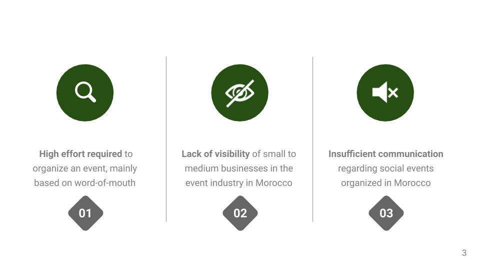
PROBLEM DEFINITION
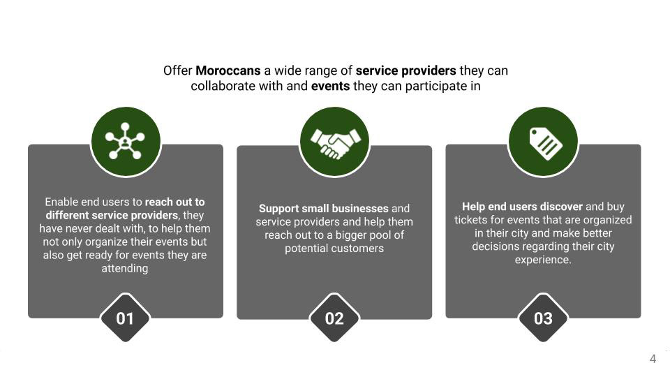
VALUE PROPOSITION
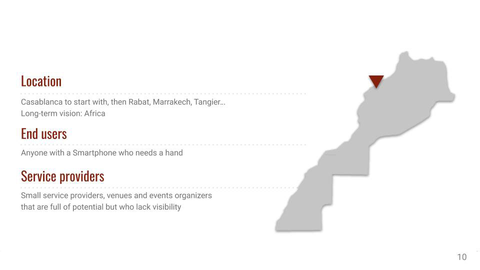
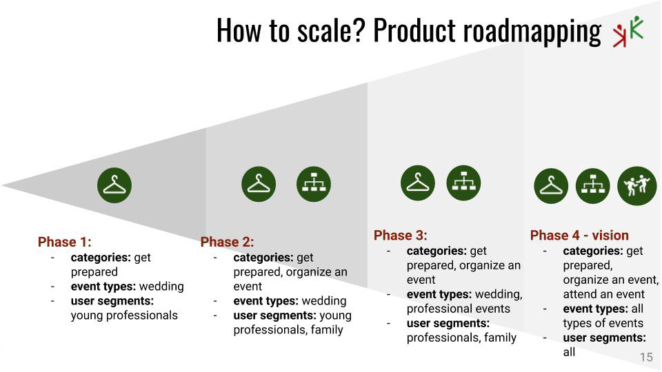
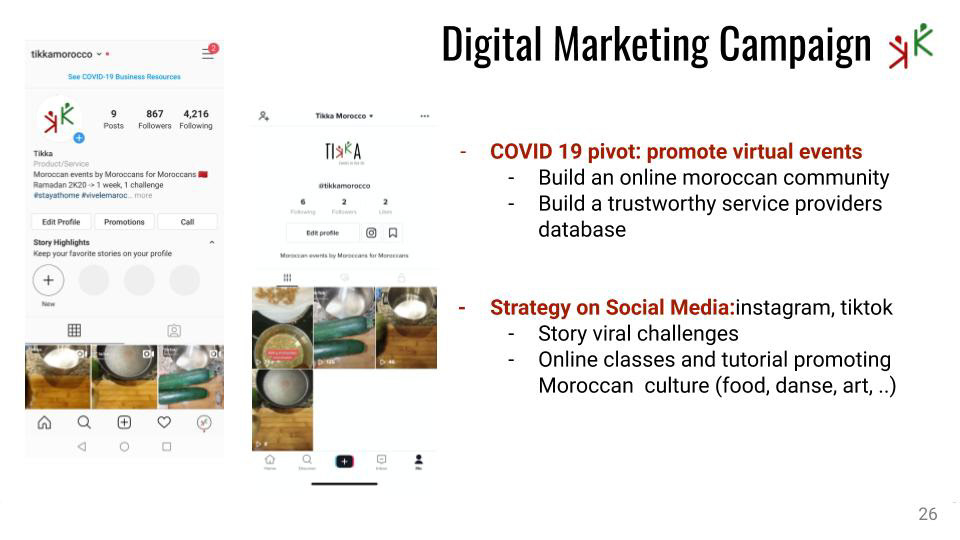
MARKET GROWTH AND SCALING


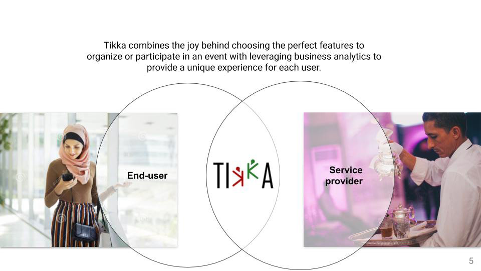
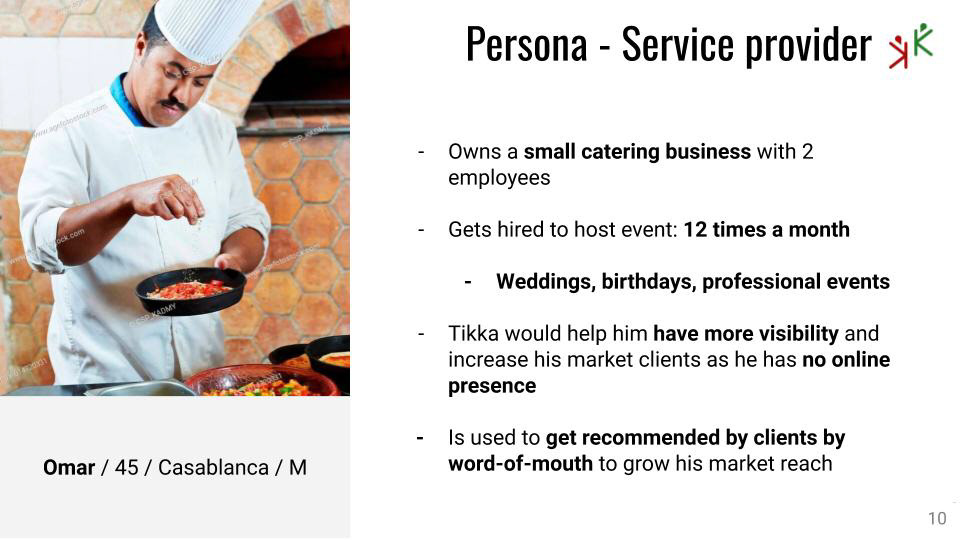
PERSONA

PRODUCT DESIGN
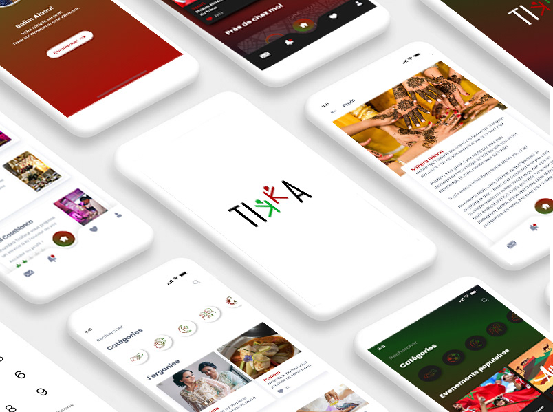
CHALLENGE 1: THE LANDING PAGE
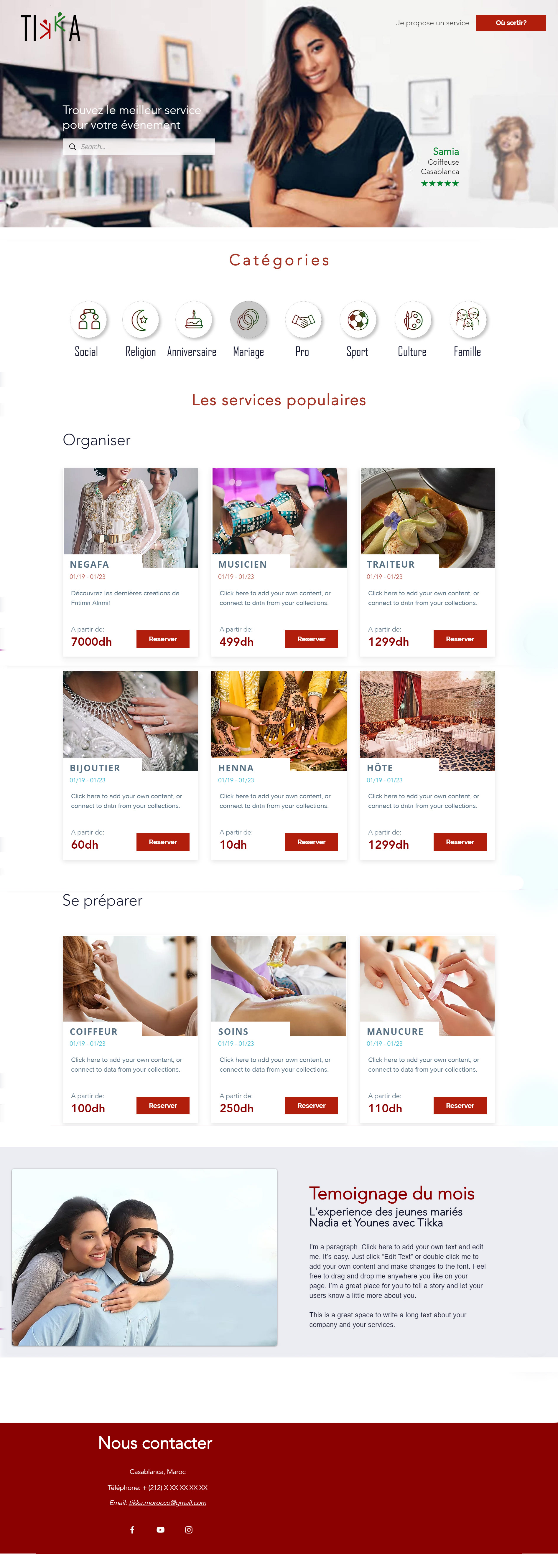
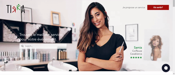
One of the first challenge was to welcome the user to a completely new environment. The product aims to be optimized for the newest generation, but also for the 50+ which is half the target market. The landing page and the first steps in Tikka need to be simple and intuitive.
In term of measure of success, impact on visibility and empowerment of service provider was our main goal all along the project development. We then took the decision to celebrate the service provider on the landing page. The content and interface is actually being tested, evaluated and tweaked in a constant stream of iteration
ORGANIC SEARCH FORM SERVICE PROVIDER HERO LOCALISATION TARGET
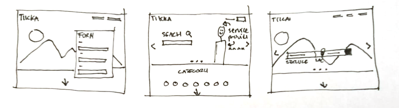
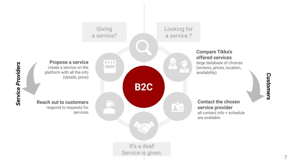
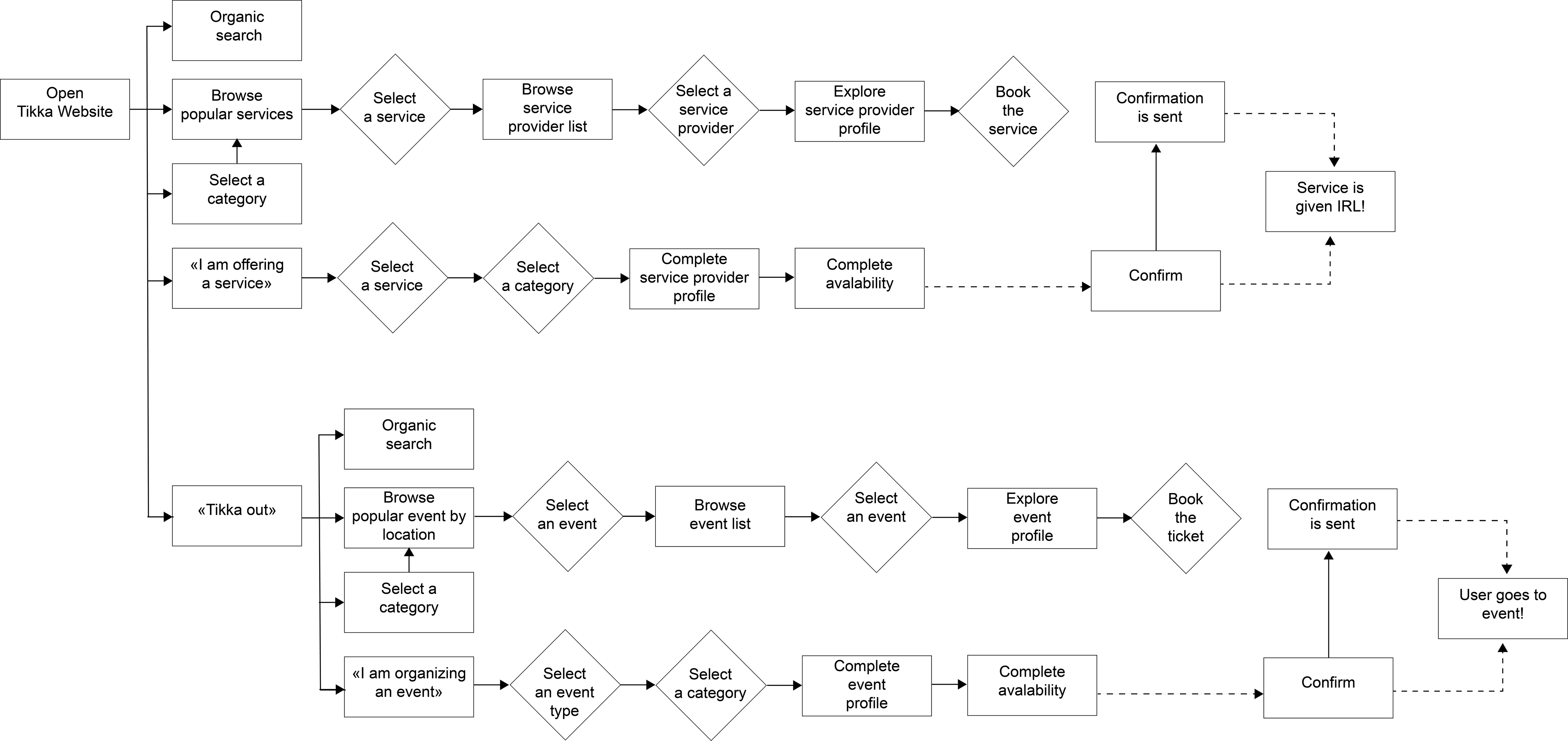
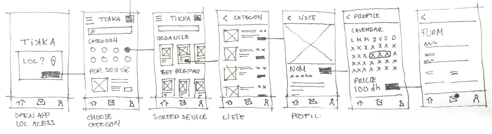
THE USER FLOW
The user has access to a very diverse dataset of service provider, the challenge was to guide him in the most intuitive way to the ideal service provider.
For that, we classify each service provider with tags of their specialties.
We interviewed and observe Moroccan social habits and needs to selected the different main categories of event:
- Social
- Religion
- Birthday
- Wedding
- Professional
- Sport
- Culture
- Family
Once the category is selected, the list of most popular event adjust by selecting the one with the according tag.
The two different needs are then clearly divided in two sections: "Organize" and "Get prepared".
USER FLOW
PROTOTYPE
CHALLENGE 2: INTEGRATION OF "TIKKA OUT"
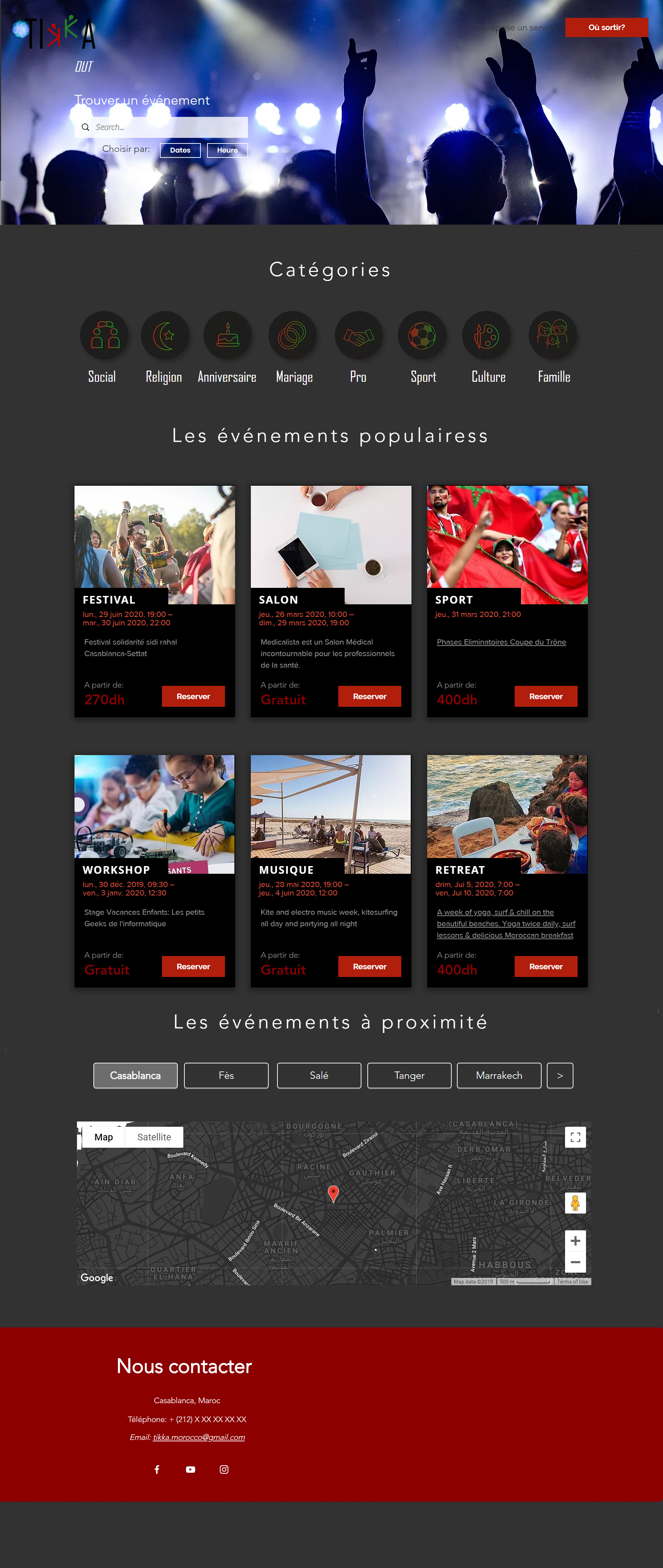
INTRODUCE FAMILIARITY
"Tikka out" solve a very different problem. While Moroccan people naturally enjoy going out and gather, they have an hard time finding what event is going on in their city.
The challenge was to unite 2 different problems, somehow linked by sharing the same market section and the same "work of mouth" culture to digitize.
Those two platforms can be unified by the design, introducing a similarity in the UI while avoiding confusion.
I decided to build "Tikka out" as an extension of Tikka. While the flow and UI is very similar, the switch from one platform to the other is obvious thanks to the clear/dark environment transition.
The map of different events in cities is added to this landing page to allow serendipity and exploration to fit the user need.
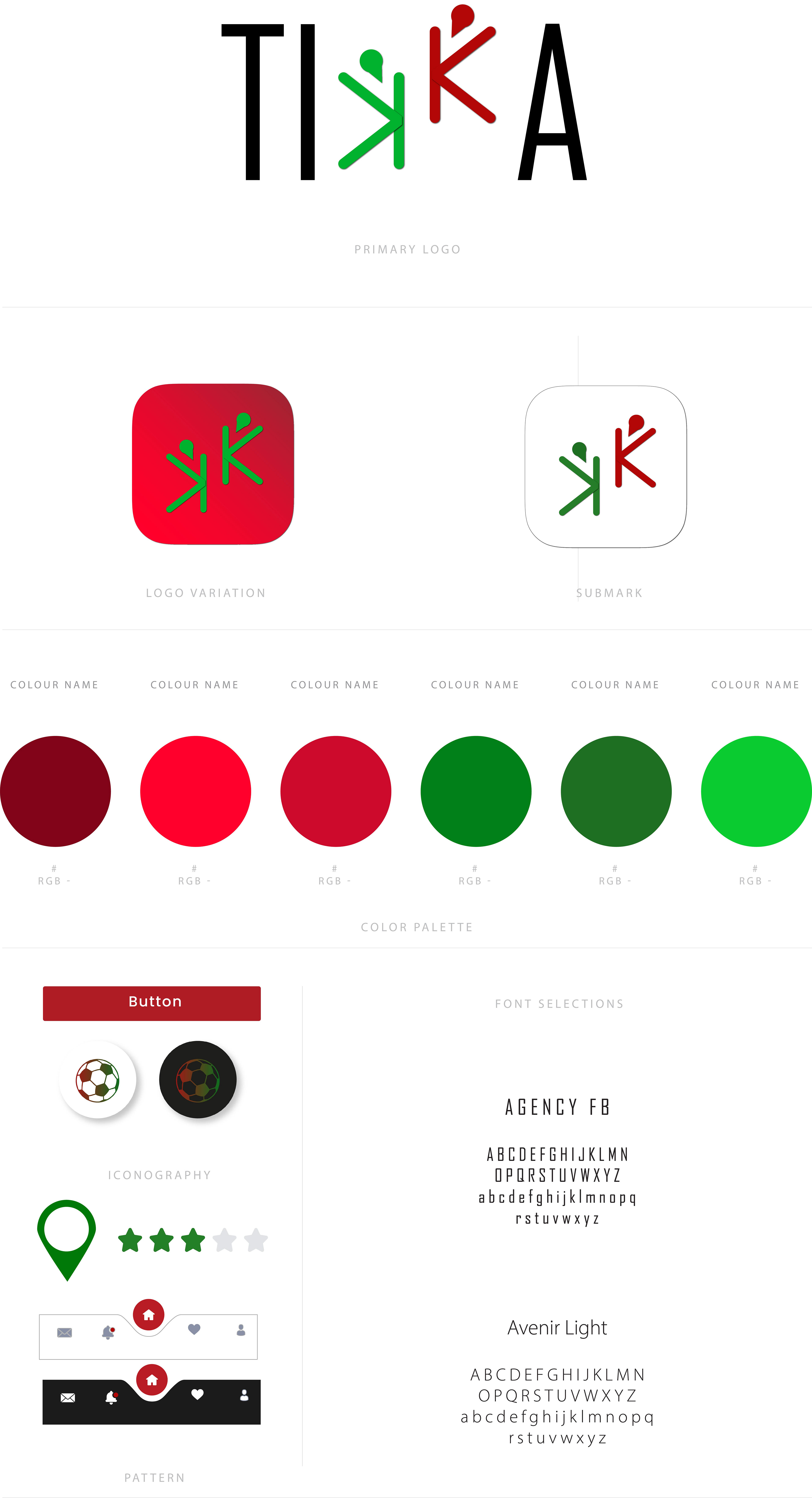
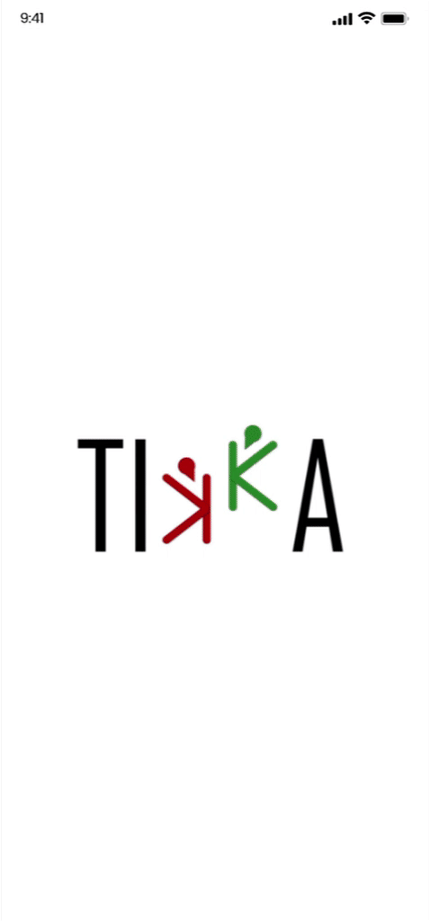
CHALLENGE 3: BRANDING RESEARCH
Visual identity was a key challenge of the creation of this product.
The user research informed that Moroccans are a very proud people, they celebrate every occasion to be proud of their country and culture (famous poeple, events, food...)
I decided to leverage this pride by emphasizing the Moroccan flag elements in the logo and brand design.
Collaboration and "trust" ("tikka" in arabic) was also a key element of the logo design.
The logo is filled with elements that reveal our vision of the product.
It represent two people: to materialize the collaboration, celebrating: to emphasize the "event industry" targeted, while their faces are symbolized by the geolocalisation logo. The two opposite K and colors reminds the Moroccan star.
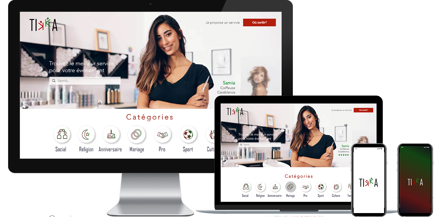
CHALLENGE 4: THE CROSS-PLATFORM EXPERIENCE
The market study revealed that an important proportion of target users use their smartphone to do their research. We decided to develop Tikka for a mobile app. The challenge was to maintain a brand experience to the different platform.
The mobile apps UI and flow aims to remind the website experience, using the same category sorting and service browsing.
Access to "tikka out" is similar, as an extension inside the main app. Events suggestion will be informed by users profile (facebook friends), and his personal history on the app.